

Valuing Xero – in 1 hour
Xero's Valuation; using limited information and under 1 hour.
Xero's Valuation; using limited information and under 1 hour.
I’ve been asked too many times what I think of Xero’s valuation – whether it’s in the last few months, or in the years gone by. I don’t have much time, so decided to set myself a time and information limit and give it a go.
So let’s walk through how to do a valuation:
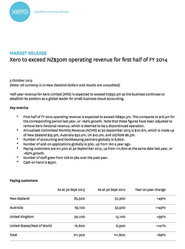
1: based on very limited information – specifically, just one piece of information – this earnings release from 3rd October:
2: And I will try to do it in an hour. I really don’t have that much time.
Constructing the financial forecast
We start by putting down what we know from the earnings release into a spreadsheet.
There is not much there, but it should, however, be enough.
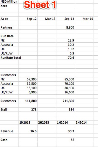
We next work out some ratios, and back-fill the run-rate numbers for September 2012. From now on we are starting to make assumptions, but we are using the known data to make sure they are roughly reasonable.
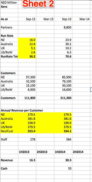
Now know that the average revenue per customer was $379.50 per year in the USA, and $279.50 in New Zealand. We could check by looking at Xero’s pricing page, or even their annual report, but that’s out of scope – I’m only using the information given.
Next up – let’s forecast forward a year, based on the same growth ratios.
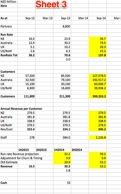
I put an adjustment in for churn and so on, but really didn’t like the thought of doing a model based on six-monthly numbers. So I stepped back and decided to convert to monthly numbers. The first thing to do was to derive the correct monthly growth rates. This is a core part of any forecast, and it’s worth a look at how to turn yearly growth rates into monthly growth rates, double checking to make sure we get the formula right:

At this stage I was recovering from the wasted time on doing the model the wrong way. But it’s normal to re-jiggle things a few times when building a model, as it’s the manipulating of the numbers that lets you understand how it will work.
I next put the months across the top of the page and got the initial growth rates sorted. I also changed the order of data on the page to be logical, starting with customer numbers, then revenue per customer and then revenue.
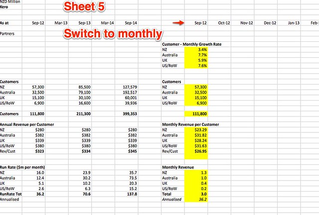
All this is very quick and I could now stretch out the table
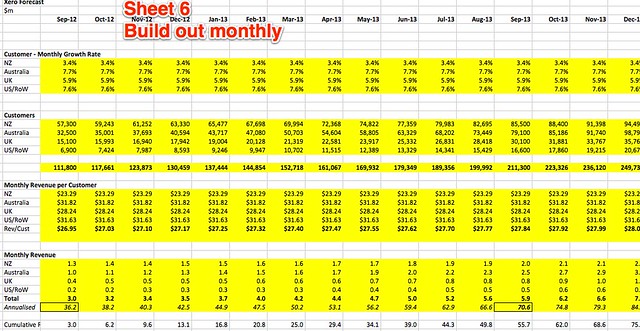
The model uses the customer growth rate per country as the main driver. US 7.6% per month, NZ 3.4% per month. These numbers feel low for folks in the early stage game, but Xero is 7 years old after all.
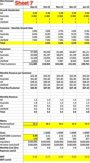
But it’s still not good enough as nothing grows forever, and growth rates fall over time.
So I put in a decelerate on the growth rates, so that the monthly growth rate would decline over time. I varied the numbers by market, so that the US and UK growth rates would not decline for a few years, and the NZ one declined at a faster rate than the Australian one.
I also put in some cost assumptions – very simply assuming that each staff member was worth $200,000 in total salary and overhead. Staff numbers were the only piece of cost information I had to go on (not even profit/loss) and so that’s the best I could do.
I used a ratio of the number of staff per 1000 customers to drive the increase in staff numbers over time, which would rise as the customer numbers rise.
From there we can derive the EBIT (Earnings before interest and tax), which unsurprisingly was negative for the first few years.
I like extending models out a long way, so I did. For something like Xero the hyper-growth is going to continue for a while, so long curves are needed to get a good grasp of the value.

I then tweaked the assumptions to make sure that the numbers were as rational as possible.
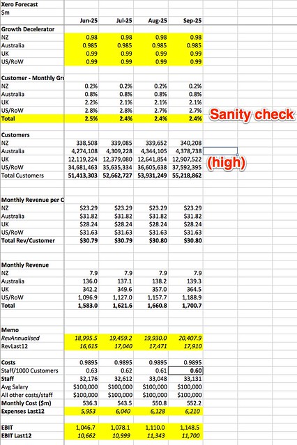
The key cost driver of the ratio of staff numbers to customer numbers was making the model lose money forever, so I cheated. I looked up Intuit’s numbers of staff and revenue, found and estimated the same for its Quickbooks division and then gave Xero a discount on that due to their better efficiency using the SaaS-only model. I then set that number to September 2025 and put a gradual decline in the staff/customer ratio from now until then. Whatever the mechanism, It is important to show that as Xero gets bigger it will have an increasingly better ratio of revenue to costs.
I then looked at the 2025 numbers to check that the end numbers were not outrageously high. They were a little for the UK and USA, but the model does not take any other countries into account, so, running out of time, I left it as it is.
I then gathered up the annual figures into one place, largely for presentation purposes. I did the Net present Value calculation on these yearly figures rather than the monthly ones. No big reason for that, and ideally I would do it on the monthly ones.
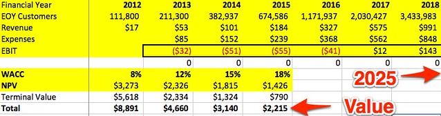
Net Present Value
The net present value (what it is worth today) varies depending upon the WACC, (weighted average cost of capital or discount rate) that we use. Think of the WACC as the amount of interest you would want a bank to pay you if the investment was as risky as Xero.
At 12%, which is often quoted as a long term stock market return, Xero’s cash flows to 2025 are valued at $2.3 billion. At 18%, which is more suitable for a fast growing company like this, Xero’s EBIT flows are summed to $1.4 billion.
However after 2025 Xero is still a going concern, and so we now need to add something which is the cause of a lot of errors and angst in valuation models – the terminal value. The terminal value takes the last years earnings and assumes that these will be constant from then on. What that’s worth depends on the WACC used, so it varies in each case. In general I advise to use this with care, and if it is too material, as it is here, then the model needs to be stretched further. The WACC used makes the value fluctuate wildly, and there is a certain amount of finding the right WACC to fit the value you want to create going on.
Results
In this case the sum of the NPV of the EBIT to 2025 and terminal value is $2.2 billion when using the 18% discount rate. (Current market cap is $2.22 billion.)
At 15% it’s $3.1 billion. I’ll ignore the lower rates as they are used for “safe” investments like electricity companies and banks. (Which I don’t believe are that safe).
So overall this very dirty and quick analysis shows that there is value there in Xero. But don’t forget that this analysis is primitive, wrong and I am not a, or your, financial advisor.
Next Steps
The next steps would be to build a proper model based on the much wider range of inputs available from Xero, both through their NZX releases and from other sources.
I would also want to test the key assumptions, in particular the USA growth rates and potential. For example, Intuit is large and ponderous, but they are trying very hard to redesign how they do business using design thinking techniques. I’d want to spend a lot of time looking at their redesigned products, and would stay in touch with them (by using them) as I followed Xero. I’d also use Xero products.
I’d probably extend the model for more years, tweaking the growth rates and other assumptions a lot harder for different stages of maturity by market.
Overall
This was all done in a very quick period of time, and from very limited information. But the purpose was to demonstrate that it is remarkably simple to get to a set of numbers that can provide useful information. Already I feel I know a little more about Xero, and some better questions to ponder as I look at their business.
There is so so much wrong with the spreadsheet, and probably several major bugs that will change things a lot, probably cancelling each other our. There is also so much to add – a model like this should have over 100 lines. But here it is.
In the end the spreadsheet took around 75-90 minutes and was a fun exercise. If you like this sort of thing then make one for your own company. Actually you should do that anyway, but use real data, a lot more lines and assumptions built up based on facts, not whimsy.
Disclaimer: Intended for educational use only. See a financial advisor before making any investment decisions.
Lance Wiggs is a director of the Punakaiki Fund.
Sign up to get the latest stories and insights delivered to your inbox – free, every day.