GUEST REVIEW
I’m bored with my iPhone.
Bored, bored, bored.
The new iPhone 5 is a lovely bit of hardware, but the app centric view feels old to me. The dream of information at your fingertips is not a screen full of application icons. I’ve been growing less comfortable with Apple’s view of the world and feeling like they have too much control.
The iPhone 5 and iOS 6 launch was a big disappointment for me. The screen was not much bigger. We got a 5th row of pretty but dumb icons.
Over the last few years Android has taken off, with rich information-centric widgets that allow you to see bite-size chunks of information at a glance. I’ve looked longingly at those giant screens but after a few minutes of playing with Android I can’t get over the lack of polish and style. Android doesn’t get me excited I’m afraid.
Windows Phone is the new kid on the block. The Windows Phone keynote resonated for me. A people-centric phone operating system with some great new features like Rooms.
Today the Nokia Lumia 920 launched. I happened to be driving past Telecom’s main retail store so I grabbed one.
I am the gadget king, right from the first iPAQ Pocket PCs, I was a Microsoft early adopter of everything in the 90s and early 2000s but made the change to Mac 6 years ago. Currently my set up for home and work is:
-
Mac Book Pro
-
iPhone 5
-
Multiple iPads in the house
-
Apple TV
-
Microsoft Exchange for Email, Calendar, Contacts
-
OSX Mail, iCal, Contacts
-
Notes in the iCloud across devices
-
MacMini at home for shared content – photos, music, movies
I’m going to share my impressions of the Windows Phone from an iPhone and Apple users perspective. My starting point is I desperately want this to be good, but I also know I might not like it and this could be a big waste of money. If I do use it for more than a few days, or even for the next year, I’ll update this post to let you know if my impressions change.

The hardware
The Nokia Lumia 920 is huge (full tech specs here). It’s a block of flats. Massive. The iPhone is iddy biddy and weighs nothing next to it. [The 4-inch display iPhone 5 is 112g, the Lumia 4.5-inch 920 is 185g - CK.]
The 920 screen is 4.5″ and it has a really good camera. Apple does not have a monopoly on making high quality gear. It’s big and beautiful – feels like you could really throw it a long way.
When you unbox it you see the beautiful Nokia SIM door key. I think I’ve lost it already (boo!). The charger is Micro-USB and it ships with black earbuds that completely seal the ear. Not ideal for a phone headset. The new Apple headsets are awesome (tried using the Apple ear buds in the Nokia – can hear but the voice didn’t seem to work).
Wireless charging pad is not included in the box.
Price was $999 to buy outright with no contract. [Nokia also has a step down model, the Lumia 820 - which has essentially the same specs as the 920 but a lower resolution, smaller display - 4.3 inches and 480 by 800 pixels to the 920's 4.5 inches and 1280 by 768. HTC and Samsung also have Windows Phone 8 handsets on the way to NZ. More here - CK].
Getting goingThe Nokia takes a bigger SIM than the iPhone 5, but the friendly Telecom staff had a SIM adapter so I could take my iPhone 5 SIM and simply swap. With my iPhone still on Wi-Fi I can easily run them in parallel.
First boot and setup was easy though the date/time wasn’t pulled from the network so had to do that manually.
Getting going with Exchange was a breeze. Exchange has autodiscovery so I just needed to enter my email address and password for all my contacts, calendar and email to be set up and synced. In under 10 minutes I was productive and connected. Brilliant.
Setting up Gmail was the same. Email and password. Easy.
Next up I wanted Twitter. Went straight to the store app where I needed to set up a Live account. That was easy and could be done on the phone. Within a few minutes I was downloading free apps. Twitter, Foursquare, AirNZ mPass, ASB, Yammer etc.
As those apps have data in the cloud I was sorted in 20 minutes.
So far so good.
Walled gardens
With my new phone up and running I could get back to work. Let’s read some emails and send some messages.
Email feels really strong. Appointments for example are much better as you can add text to replies in meeting requests. I’ve always missed that on a Mac and iPhone. For Exchange users, email is just better on Windows Phone.
But when I went to send a message I realised I no longer have iMessage. Messages don’t turn that reassuring blue where you feel “cool, this is free”. I’m back to sending txts and paying message by message. That seems a step backwards. I guess my phone plan has lot’s of txts built in, but I have my first feeling of giving something real up.
As I surf around the apps on the 920 I find Rooms and remember the great demo in the Windows Phone launch video. But no one close to me has a Windows Phone. So can’t use Rooms. As I look at other apps like People and some of the people centric touches in contacts, I can’t use those either. These would be super cool if my work mates and family were on Windows Phone. They’re not.
Damn those closed ecosystems.
When I get home I download the Windows Phone app for OSX on my Mac Mini. I can see my iTunes collection. After sorting out a security issue I can sync photos, music and music videos. I wasn’t expecting that. TV and movies don’t come across, but of course I’d watch those on my iPad anyway.
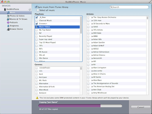
Click to zoom.
So your iTunes investment is not a waste. Hooray!
Design and usability
Immediately I like that the home screen has information on it. I can see I have new emails, a text and my next appointment. Why haven’t Apple done the simple stuff yet?
Whereas I probably use 80% of an iPhone I think I’m only using 20% of the Windows Phone. There’s a lot of stuff there I haven’t played with yet.
So my first comparison is doing the normal stuff. Email, Twitter, appointments and calls.
The Windows Phone operating system is different. Once I found the convention for settings I could get most things right. I did notice there were not a lot of options under settings in the apps I was using. The apps are good so far but I get the feeling they didn’t have time to build out options for things that you would normally expect to tweak in each app.
Twitter is fully done in the Windows Phone style. It’s cumbersome to get around.
I’m starting to think about the Windows Phone interface style. It feels very ‘designed’. By that I mean it feels like a guy who drives a Saab and has square glasses designed it all. It looks pretty and fluid. It’s sophisticated. It’s clean. For example it does away with dividers in lists. Big fonts, not a horizontal line, indicate a new item. Subject being blue means the email is unread. Even in Twitter, the view buttons on the iPhone are big text headings. It’s flat. It’s all text.
It feels almost too sophisticated. Too clean. Like an ultra-modern house. Beautiful but not comfortable.
I’m not sure I like it. Not sure I can live here. Am I too messy to live here maybe?
I like the tiles. Tiles give you information so they are better than app icons. They’re alive, but they are flat. 2D. The device has an awesome screen but the UI is 2 colour paper. Is this too cool?
I have to think about stuff. My brain needs to decipher what’s going on. It feels like I’m abstracted from the data.
Is it because it’s different or is this design making me work harder. I’m not sure yet.
There is so much whitespace. Headings are huge. Is there more on the screen? I need to check.
Suspicions are confirmed …
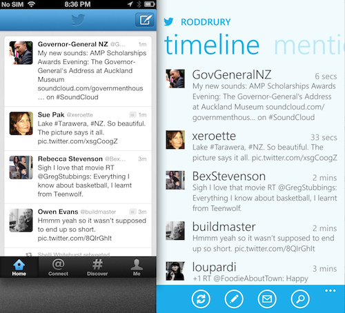
Click to zoom.
The spaced out design of Windows Phone and large fonts mean that there is barely more information on the screen compared to the far smaller iPhone. The 920 is massive. The screen is half an inch bigger yet I don’t get even another readable tweet on the screen.
On the web browser you do see more of a page.
But then I check email. I see five full messages on the iPhone but only four on the Lumia 920. Wow. That’s nuts.The phone is bigger, but I feel like I’m not seeing as much in the apps.
It’s that Saab driving square glasses guy. That architect who does the hyper modern, but cold, house. He’s been too indulgent. He got carried away. Form overrode function. That’s Windows Phone 8 today. I’d love to see this with a condensed view so I can see more data. Can I do that?
Interface models
There are three clear models now
-
App centric: iOS. Select an app and work with its data
-
Information centric: Android the closest. Apps + information widgets where you can see information at a glance then go to each app
-
People centric: Windows phone. For each person display everything about them. I’m so glad Microsoft took a new tack to do something quite different. But I don’t think I work like that. I like information first and ideally I’d like my primary UI to be a live dashboard where I can configure any information to be displayed at a glance.
Windows Phone Live Tiles are a much better model.
I just hope that Apple add an information centric view in iOS 7. Possibly the reason they haven’t is continually updating tiles would require a different model than their single app notifications and possibly use a lot more battery. But I’m sure some smart people can work that out. Perhaps your entire dashboard is maintained in the cloud so a single push update can refresh all widgets?
Jumping back
After a few hours I pick up the iPhone. It is so small and light. It’s fast. Familiar.
The information seems more direct. I like that email messages are clearly delineated. My eyes don’t have to think where do messages start and stop.
It’s easier.
I go back to the Windows Phone. Everything is bigger. There isn’t any more. It’s just super sized. I don’t dislike it but I’m having doubts.
Impressions after day one
I suspect I’ll go back to the iPhone. Not 100% decided but leaning that way. I’m so glad Microsoft and Nokia built a beautiful product. Competition is great.
I hope Apple, after their leadership changes, will do iOS 7 quickly and implement some of the great concepts in Windows Phone and be more information centric.
Windows Phone is a breath of fresh air. It’s very innovative. It pushes the boundaries. But it’s harder and Apple have had 5 years to build their ecosystem.
The question is does Windows Phone become a success in its own right, or is its ultimate contribution that it finally shakes Apple from its complacency and reinvigorates iOS?
The one thing I’d like Microsoft to change is to shrink the interface so I can get more information onto the bigger screen.
For iPhone users there has to be a payback for this massive device. The lack of additional useable screen probably means for you there isn’t a significant advantage to migrate to Windows Phone. But it works and is a breath of fresh air in its approach.
If you are a Windows User and drooling over the Surface you should be very pleased that you have a first class phone experience that is innovative and consistent with where Windows 8 is going. But I’d look at smaller models closely.
Well done Microsoft for some great innovation.
Apple. You need to get your act together.
Update: 27 November. I lasted 4 days
After 4 days I was back to the iPhone. On day 3 I was using both during the day and thinking hard about which way to go. In the end it came down to:
-
There was not sufficient payback for the giant phone. I wasn’t seeing more information in the apps I use the most. I’d really like to see Windows Phone 8 on a device that is as small and light as the iPhone 5.
-
The apps I use are not quite there yet. For example the Air New Zealand mobile app allows me to easily add flights to my calendar. I fly a lot and I won’t type them in manually. Also Twitter, as a full Windows Phone 8 app was not as nice to use. [And where is Instagram? How can any person exist without Instagram? - CK]
These things are fixable, hopefully in months so I’ll definitely check back in with Windows Phone as it updates.
My final thoughts are:
-
I’m so glad that Windows Phone exists. Competition is great and there are some delightful features. It feels closer to the information at your fingertips vision.
-
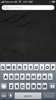
I’m really annoyed that Apple has not innovated from their early lead. The app centric model is dated. We need a new screen. It could be the search screen (see below) where you can configure your information widgets to see information at a glance. The lock screen is a wasted opportunity that should be configured to show number of emails, messages, next appointment and things such as that.
-
The iPhone 5 could be bigger. Another cm wide would make a difference, especially when reading web pages in landscape. I sent a message on an iPhone 4S in the weekend and I can’t believe we tolerated such a small screen for so long. It feels comically small now.
-
Mail on iOS and OSX could be much better against Exchange. Especially appointment handling which is a big use case for corporate users.
There are people that will love Windows Phone 8. If you’re in the Microsoft ecosystem you can be proud of your phone.
Our head of Product – Tokes – is one such person that always looks guilty when he pulls out his iPhone. I’ve given the 920 to him. Let's see what happens.
Rod Drury is chief executive of Xero. He posts at blog.xero.com.
Rod Drury
Tue, 27 Nov 2012